Designing my own Logo
- Sean Suputra
- Sep 29, 2022
- 3 min read
When I was getting to the final iterations of my website design, I decided that it was time to start creating a logo for my motorsports brand. Luckily, I had a subscription to Adobe Illustrator from a project earlier in the year.
Initial Inspiration
Simplicity, boldness, and intention are the words that quickly come to mind when thinking about approaching designing my logo. I've learned that simplicity has the best chance of lasting the test of time, and I was going to try and capture a fraction of what the Helvetica font achieved. To compliment this simplicity, I wanted a bold look, with a contrast of thick lines and color blocks. Finally, I wanted it to be intentional, thinking about the potential modes the logo will be used. For example, it would be cheaper to print with fewer colors, it has to be recognizable at different sizes, and the logo should have the ability to be reduced to a simplified, yet familiar, version for even smaller use-cases.
The Name
I have been toting around the same "handle" for a while...sssuputra. Somehow, I wanted to retain its use while distinguishing the motorsports element of the new brand. The go-to options looked like:
Sssuputra Motorsports
Sssuputra Racing
Racing Stuff (I was really attached to this for a while)
That was when I realized this was the perfect opportunity to use the nick-name bestowed upon me while working for a Tier 1 automotive supplier. I went to the plants in Mexico a lot and received surprised, even offended, reactions when I introduced myself: "Sean Suputra". They informed me that this closely resembled a phrase that isn't..."safe for work". From then on, I was "Sean Suputra Madre", or "Suputra Madre".
Design Process
With the name figured out, the real design work started, so I took advantage of Ben to spark up the brainstorming process. Ben is my college roommate and Tejas Club bro, and he was visiting Austin for the week. We went to one of his old coffee shop stomping grounds by the lake and I forced him to start putting pen to paper!

On my own, I took some time to see what we came up with. I knew I wanted to highlight the "sss" in my name, so I remembered the simplicity factor and landed on this, the first step in a promising direction.
Now, the logo needed a way to show that it was related to motorsports. There are all the classic symbols of racing available, but the helmet seemed right, considering my driver focus (not mechanical) and desire for simplicity. Combining this symbol with the version above by putting the "sss" in the visor seemed like the obvious next step. During this whole website creation process, this one color kept standing out to me. It was a lighter version of "seafoam-green" and had a neon feel to it...so I am just sending it with this color (or something close for other things). After some adjusting here and there, I came up with this as a first iteration to use on the website!

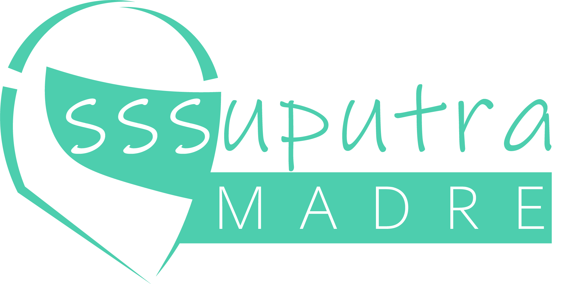
I sat with the logo for about 2 weeks. To be honest, the helmet looked really awkward to me and close friend. I went looking for more "abstract" representations of helmets and found a good brush-stroke style. I incorporated into the current logo and here we have, the current logo!!!

Wrap Up
It was really fun to work with Ben on the logo and I appreciate him humoring the effort. It only took about a week to get the first iteration to a usable state on the website, and another weekend to get the brush-stroke effect incorporated. It'll be an evolving design, but hopefully I won't have to touch it for a while (like 5 years, at least).
Do you have a company or a brand without a logo? Do you feel like your logo could use a fresh renovation? Feel free to reach out and we can start tossing around ideas for a project!


